As weather forecasters, here at MetService we spend a lot of our time poring through data: data from weather stations, data from satellites and radar, from weather balloons and also webcams. This information is all useful for understanding what the weather is doing right now – but how do we know what might happen in the future? Understanding the current weather helps us understand what might come next, but information from numerical weather models also plays a very important part. Numerical Weather Prediction (or NWP) is the science of forecasting the weather by using the governing physical equations of the atmosphere (pretty complex equations!). A weather model essentially takes observations of the current state of the atmosphere, and uses these complex equations to step forward in time. With modern computers, we can process large amounts of information in this way, and weather models are becoming increasingly accurate. But what were the first numerical weather models like? And how have the changes in these numerical weather models improved their accuracy over time?
In the beginning…
Our story begins in 1904. Vilhelm Bjerknes, a Norwegian physicist and meteorologist, postulated that if we could accurately measure the current state of the atmosphere, then we could use the governing equations of fluid dynamics to step this forward in time, and forecast the future state of the atmosphere. There were two problems he saw with this approach. Firstly, the equations are by no means simple, and no exact solution for these equations existed (even to this date, there is no analytical solution to these equations – or in other words, you can’t just ‘solve for x’ as you would have been taught in school – the solutions must be approximated). Secondly, the accuracy of any forecast will be dependent upon the accuracy of our measurements of the current state of the atmosphere, i.e. how accurate is the information from weather stations? And, more importantly, are there enough weather stations to accurately depict the current state of the atmosphere?
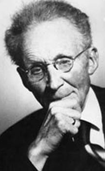 Photo: Vilhelm Bjerknes
It wasn’t until 1922 that someone attempted to put this idea into practice. The attempt was made by Lewis Fry Richardson, an English mathematician, physicist and meteorologist. He used recorded weather observations from 20 May 1910, at 7am, and attempted to use the equations of fluid dynamics to calculate what the air pressure would be six hours later – which he could then compare to measured data. It took him six weeks to do the necessary calculations by hand – and the result he obtained was wildly inaccurate. His results predicted a rise in air pressure of 145 hPa – while this was not only inaccurate when compared to the observed pressure at the time, it is also physically unrealistic – this kind of pressure change has never been observed!
 Photo: Lewis Fry Richardson
Despite the failure of Richardson’s attempt at Numerical Weather Prediction, he is considered a pioneer in weather forecasting. His approach was a simpler version of the way NWP is carried out today, though there were subtle flaws in his computational method. Even if he had recognised these flaws at the time, before the age of computers, it is estimated that a forecast for tomorrow’s weather would require 60,000 people working on it in order to complete the forecast in time.
With the invention of computers…
Because of the sheer size of the problem of finding solutions to these equations, Numerical Weather Prediction didn’t really take off until the invention of the computer in the 1940’s. Jule Charney, an American meteorologist, lead a computational meteorology group at Princeton University from 1948. By the early 1950’s, Charney and his group were successfully running a numerical weather model over three layers of the atmosphere using a simplified version of the governing equations of the atmosphere. In 1958, a single-level numerical weather model was being used operationally by weather forecasters at the US Weather Bureau. This weather model gave forecasts for an altitude roughly 5 km above sea level. This was because it is much easier to model free air flow above the Earth’s surface than it is to model the wind and weather near the ground, and it still gives useful information about large scale weather features such as lows, highs and fronts.
Over the coming decades, NWP advanced in leaps and bounds. As the available computational power has increased exponentially with time, weather models have been allowed to become exponentially more complex. By 1966, a 6-level model covering the northern hemisphere was generating forecasts using the un-simplified (or ‘primitive’) equations of the atmosphere with a resolution of 380 km (an example of this resolution shown below). Over the following decades, the resolution of the models was continually improved. By 1990, weather models were being run over the whole globe, over 18 levels in the atmosphere, and with an effective horizontal resolution of 160 km. Methods of statistically adjusting raw model data based on historical observational data from weather stations were also introduced.
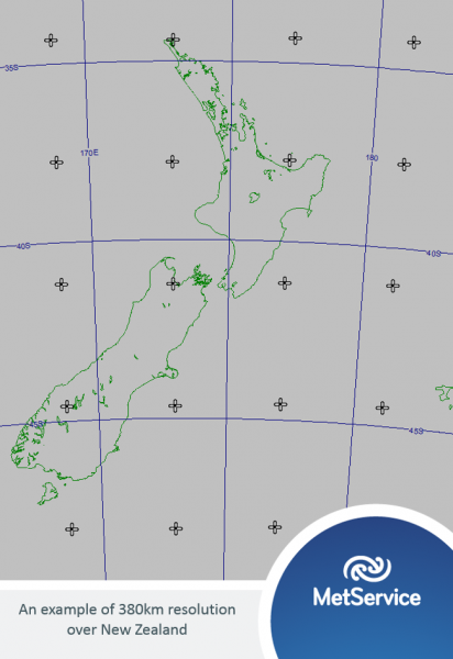
A grid over New Zealand with 380 km spacing. A model with 380 km resolution like the one described above would essentially give numerical weather forecasts for the points on this grid (though it was over the northern hemisphere, not New Zealand). The higher the resolution of a model, the closer the points on this grid would become, therefore giving a clearer picture of what the weather will do.
The problem of resolution
While the resolution of these models was improving, it still posed problems. The models worked well for forecasting large-scale circulations of the wind. However, they were not capable of accurately predicting phenomena on scales smaller than the resolution of the model. For example, thunderstorms in New Zealand are generally only a few kilometres across in size – and therefore cannot be accurately predicted by a model with an effective grid spacing of 160 km. One solution to this is parameterisation. Parameterisation represents these sub-grid-scale processes by using variables that can be resolved by the model – for example, rather than predicting thunderstorms, instead a measure of instability such as the Lifted Index, which can be calculated for every point in the model grid, can be used to give an indication of how likely thunderstorms are to form. Similarly, while individual clouds cannot be resolved, we can instead look at relative humidity.
Another solution to the problem of resolution, is simply to work with a finer grid. However, each time you halve the horizontal grid-spacing, this quadruples the number of grid points you are working with (and you also have to halve the time step – there are mathematical reasons for this). The larger the number of grid points, the more calculations the computer needs to do. The more calculations the computer needs to do, the longer it will take the model to run. For a model to be useful to operational forecasters, it needs to be ready reasonably quickly, and therefore there is a trade-off between resolution and time. For this reason, Local Area Models (or LAMs) were created.
LAMs are similar to global weather models, but they are only run over a small area (for example, MetService runs LAMs over New Zealand). Running the model over a smaller area means that we can use a finer resolution, while still keeping computing times reasonably short. However, LAMs do pose their own problems – for example, errors can be introduced when a weather system crosses the LAM boundary. LAMs were first introduced in the late 1960’s, and improved in step with the global weather models.
Making use of weather satellite data
Another important part of the modelling process is data assimilation. This refers to the process of taking the initial state of the atmosphere, using measurements from weather stations and weather balloons, and using this data as a starting point for the model. However, in the 1970’s, methods for assimilating satellite data into the weather models were introduced. This was a huge step forward; weather stations are usually grouped in areas of high population, and there are vast areas of the globe with very few or no surface-based observations available (for example, there are very few weather observations in the oceans – just the odd weather station on a remote island or a few drifting buoys or ships provide the only surface-based observations across large swathes of ocean). Weather satellite data gives a more complete coverage of the globe.
There are challenges associated with using satellite data – satellites measure electromagnetic radiation, and use this to make inferences about temperature, humidity, wind etc., which is not necessarily straight forward. However, the increased coverage of the globe provided by weather satellites means that the benefits outweigh the challenges. Historically, weather forecasts for the southern hemisphere had lagged behind those for the northern hemisphere in terms of accuracy, simply because there was relatively little data available in the southern hemisphere (the southern hemisphere has less landmass and therefore fewer surface based observations available). With the assimilation of satellite data into the models, this helped to close the gap between the northern and southern hemispheres.
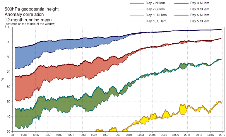
This plot shows a measure of accuracy for the ECMWF weather model for forecasts for 5km above sea level, for a number of days out (reference: https://www.ecmwf.int/en/forecasts/quality-our-forecasts ). It shows that forecasts 3 days out (blue lines) are more accurate than forecasts 5 days out (red), which are more accurate than forecasts 7 days out (green), or 10 days out (yellow), as you would expect. The lower line of each graph represents the accuracy of forecasts for the southern hemisphere, while the upper, bold lines represent the accuracy of forecasts for the northern hemisphere. As advancements have been made in satellite technology, this has helped to bring the accuracy of forecasts for the southern hemisphere in line with that for the northern hemisphere.
Allowing for chaos…
In 1961, Edward Lorenz, an American mathematician and meteorologist, noticed that very small changes in the initial state of the atmosphere fed into the weather models could cause the resulting forecast to be very different. He called this ‘The Butterfly Effect’, and gave the analogy of a butterfly flapping its wings in Brazil, creating a ripple effect that would eventually cause a tornado several weeks later in Texas.
 Photo: Edward Lorenz,
https://en.wikipedia.org/wiki/Edward_Norton_Lorenz
This idea was troubling, because it meant that there was a very short timeframe within which weather forecasts could be useful. Lorenz recognised that any small errors fed into the model, which were impossible to avoid, would eventually cause the forecast to descend into chaos. For example, there will inevitably be a margin of error associated with the pressure measurements taken by our weather stations, even if it is very small. However, these small errors can result in much larger errors as we try to forecast the weather further and further ahead. Or as Lorenz posed the problem in his 1963 paper:
“Two states differing by imperceptible amounts may eventually evolve into two considerably different states... If, then, there is any error whatever in observing the present state—and in any real system such errors seem inevitable—an acceptable prediction of an instantaneous state in the distant future may well be impossible. In view of the inevitable inaccuracy and incompleteness of weather observations, precise very-long-range forecasting would seem to be nonexistent.”
It took some time before this problem was addressed. The year 1992 saw the introduction of ensemble models. Up until then, weather models were deterministic in nature, i.e. given the initial state of the atmosphere, there is only one possible solution for what the future state of the atmosphere will look like. This approach failed to take account of the inherent chaotic nature of the atmosphere, nor does it allow for the inherent error that will be present in our measurement of its initial state (we can’t measure every wing-flap of a butterfly!), or our incomplete knowledge of the physics of the atmosphere. On the other hand, an ensemble forecast is probabilistic, i.e. given an initial state of the atmosphere, there are many possible solutions for what the future state of the atmosphere will look like, each with differing probabilities.
An ensemble forecast is obtained by running the deterministic model multiple times, each with a slightly different initial state. This gives a distribution of possible future states of the atmosphere, and we can then look for clusters within these solutions. As an example, you may remember Tropical Cyclone Winston which caused widespread damage across Fiji in 2016. Some media outlets prematurely published articles stating that TC Winston was going to move over New Zealand. However, this forecast was based on a lack of understanding of ensemble models. The deterministic model produced by NOAA indicated that TC Winston would move over New Zealand. Meanwhile, the forecasters at MetService were looking at the ensemble forecast, and noticed that the deterministic solution was an outlier, and the cyclone was more likely to head towards Fiji.
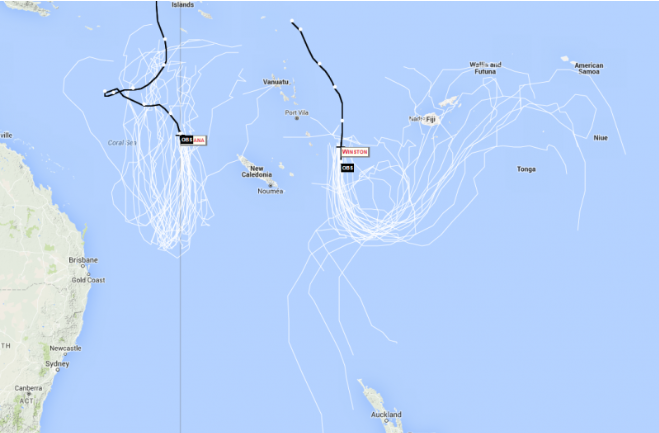
Ensemble forecast showing possible tracks of TC Winston (and TC Tatiana to the west). Most forecast tracks indicated that TC Winston would move towards Fiji. Only a few outliers sent it southwards to New Zealand. Image courtesy of NOAA Earth System Research Laboratory.
So where are we now?
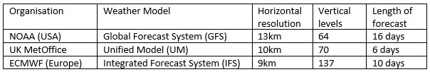
Here at MetService, we use data from three different global weather models, produced by different organisations around the world. The table below gives the resolution and the number of vertical levels of these three models, current as of December 2017. MetService receives a subset of the data from each of these models. We also receive data from ensemble models from NOAA and ECMWF.
Here at MetService, we also run several Local Area Models over New Zealand. These models have horizontal resolutions of 4 – 8km, and you can view some of the output from these models here.
Improvements are always being made to the models. Whether it be implementing the findings of new research into the effect of soil moisture on humidity in the lowest layer of the atmosphere, or implementing new parameterisations to represent the effect of friction from buildings or forests on wind speed, or simply improving the resolution of these models, improvements are always taking place.
So what can a human forecaster add?
While the resolutions of these models are ever improving, they still struggle in areas with complex topography. This is particularly true in a country like New Zealand, where we have very steep terrain, lofty mountains, and narrow valleys, Fiords and Sounds.
Take Milford Sound, for example. Mitre Peak, on the southern side of the Sound, rises to 1,693 m in altitude. On the northern side of the Sound, The Lion rises to 1,302 m in altitude, as shown on the map below. The two peaks are only approximately 2 km away from each other horizontally, but the ridges drop away steeply to allow Milford Sound to weave its way in between. The wind is often funnelled down Milford Sound, particularly when the sun helps to heat the land, creating a sea breeze. This can mean that the weather station at the airport will record gusty northwesterlies during the afternoons. However, a weather model with a 4 km resolution is unable to accurately depict the topography around the Sound, and therefore will not accurately model the winds at the airport. On the other hand, a human forecaster has knowledge of the local topography, as well as historical knowledge of how the land affects the wind in the area, and can therefore predict the northwesterly wind at Milford Sound with accuracy.
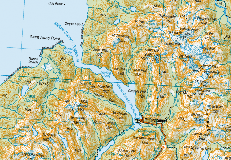
Map courtesy of www.topomap.co.nz
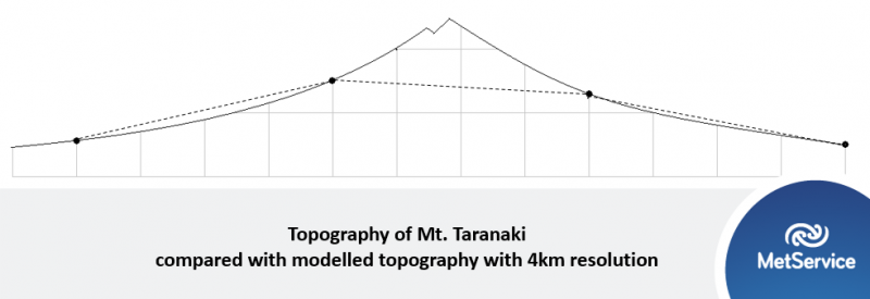
Another good example is predicting whether it will snow on our mountains and ski fields. Let’s look at Mt. Taranaki, which rises to a peak at 2,518m altitude. The diagram below shows the approximate profile of Mt. Taranaki, where each grey square represents 1 km. The black dots show points on the Mountain 4 km apart. The dotted line joining these dots therefore shows the topography of Mt. Taranaki, as viewed from a model with 4 km resolution. As you can see, the highest point is only about 1.5 km high. The model effectively ‘chops off’ the top of the mountain.
What does this mean in terms of predicting snow? The model gives quantitative snow forecasts – i.e. how much snow will fall, and what is the extent of the snowfall. In lower lying areas, this can give a good starting point for meteorologists forecasting snow in our towns and cities (though this forecast still needs some refining by a meteorologist). However, if we look solely at model data, we would very rarely predict snow when it only affects New Zealand’s mountains. Of course, snow is a regular occurrence at altitude – this is why MetService forecasters produce specialised mountain forecasts, which give the altitude to which snow is expected to fall. They do this by looking at a combination of different types of model data and data from observations, and combining this with their knowledge of the local topography. I won’t go into the specifics of forecasting snow here – that could be another whole blog topic!
Another area where meteorologists can add value to the model data is consultancy, which is an area that is always growing. Weather models provide us with a wealth of data – but this data is no use to the end user unless they know how to interpret it. This is where consultant meteorologists come in. They work side by side with clients who have very specific needs in terms of what they need to know about the weather in order to operate their business. To name a few examples: we recently had one of our severe weather meteorologists as an onsite weather consultant for the LPGA NZ Women’s Golf Open, predicting everything from strong winds, thunderstorms, lightning and hail; we have a group of meteorologists who work with energy clients in Australia, helping identify risks of extreme heat; we have a group of meteorologists here in Wellington who put together specialised Tropical Cyclone forecasts; and many more!
Where to from here?
NWP has come a long way since Lewis Fry Richardson made the first attempt at numerically predicting the weather nearly a century ago, back in 1922. The job of a meteorologist has also drastically changed since his time. Of course, research into the physics of the atmosphere is ongoing; there is plenty of room for further improvement on current weather models, and they are continually being updated. Here at MetService, we often ask ourselves what the job of a meteorologist might look like in 5 or 10 years’ time. What will weather forecasting look like next century? Only time will tell – I imagine even Lewis Fry Richardson would have struggled to envision what weather forecasting would become nearly a century after his historic attempt at NWP.
Sources
https://www.britannica.com/biography/Vilhelm-Bjerknes
Victoria University GPHS425 NWP Course notes
https://en.wikipedia.org/wiki/Lewis_Fry_Richardson#Richardson.27s_attempt_at_numerical_forecast
http://www.bbc.com/news/uk-scotland-south-scotland-23242953
https://www.technologyreview.com/s/422809/when-the-butterfly-effect-took-flight/
https://www.metoffice.gov.uk/research/modelling-systems/unified-model/weather-forecasting
https://www.ecmwf.int/en/forecasts/documentation-and-support
http://www.emc.ncep.noaa.gov/GFS/doc.php
Other MetService blogs which may interest you:
https://blog.metservice.com/forecasts-and-uncertainty
https://blog.metservice.com/understanding-the-long-range-forecast
https://blog.metservice.com/To-Be-A-Meteorologist