August 2012
One evening, having just arrived home after the short walk from Trentham Station, I remarked to my family that it was unusual for the wind to blow from the northeast in Upper Hutt. Five days later and it was still blowing from there.
For over a week, mean sea level pressure had been higher than usual south and east of New Zealand while pressures were lower than usual over the Tasman Sea (to the northwest). This anomalous pattern is not confined to the surface – it extends up through the troposphere and further. This is known as a blocked pattern, where highs and lows become slow moving or stationary. Such slow moving frontal systems can result in heavy and sometimes intense rainfall, and this was reflected in the Severe Weather Warnings affecting south Canterbury, Waikato, Coromandel and Gisborne during that week
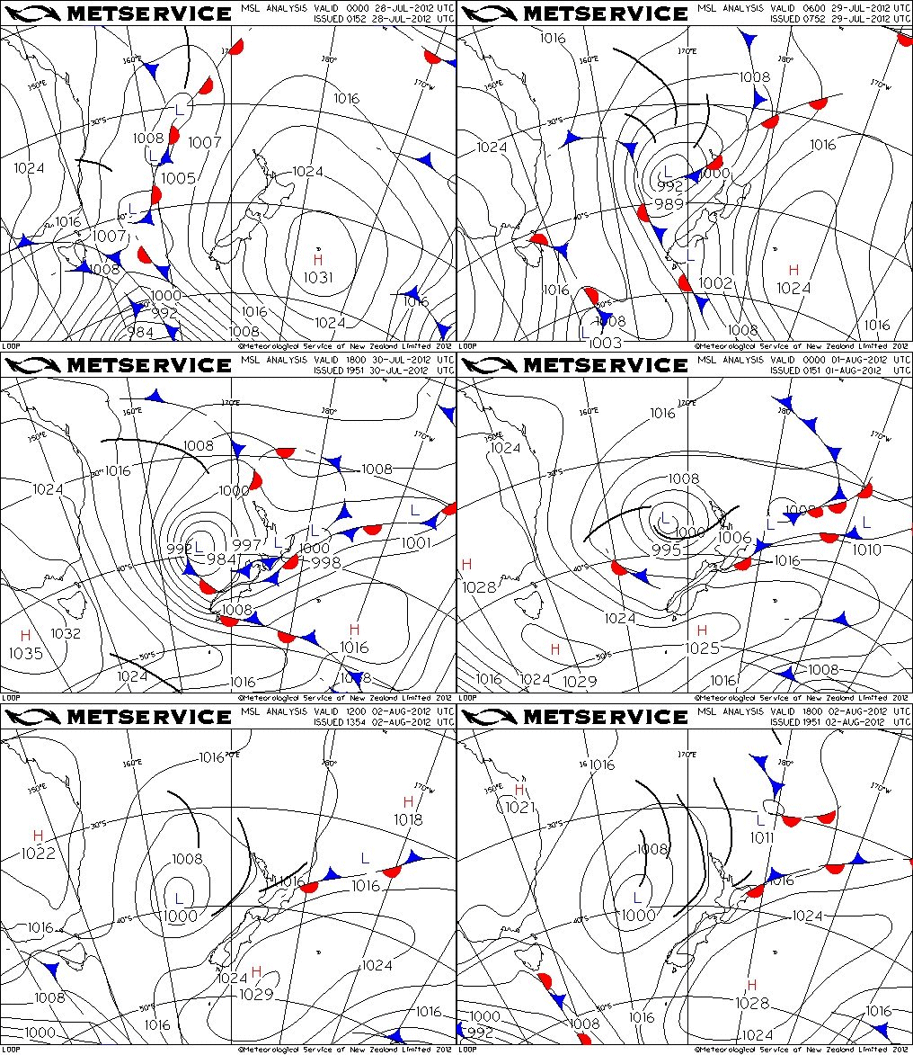 Animation of MetService MSL analyis charts at 6 hour intervals over the Tasman Sea and New Zealand area, 28 July to 3 August 2012.
The animation here shows the high pressure to the southeast as either a ridge or an anticyclone. The depression over the Tasman Sea went through the complete life cycle from early stages of contrasting air masses on 28 and 29 July, through development and deepening on 30 and 31 July, to mature and filling in on 1 and 2 August. By 3 August there was a fairly uniform air mass of rotating belts of convection.
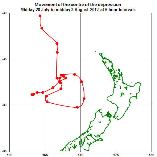 Path of the centre of the low (the point of lowest pressure) starting from midday 28 July (top left of map) and ending 6am 3 August 2012.
The simple map above shows the meandering path of the centre of the depression during this time. The track starts near the north boundary of the map and ends towards the western boundary. The satellite image below shows the old low centre on the afternoon of 3 August with bands of moderate convection spiralling out.
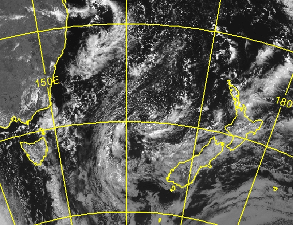 Visible satellite image at 3pm 3 August 2012 NZST from the MtSat-2 meteorological satellite, courtesy of Japan Meteorological Agency.
All this time, the wind flow over central and southern New Zealand has been from the northeast. For Wellington this has resulted in an unusually long period of wind from between east and northeast. Winds of this direction are fairly rare as shown in the diagram below, called a wind rose.
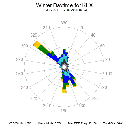 This wind rose was constructed from hourly wind observations. The length of the coloured bars is proportional to the hours of wind from that direction, where 360 is North. The colours further partition the wind into speed ranges. The longest bar represents 12.1%, and the range circle at half way represents 6% (of the time).
Diagrams such as these are called wind roses because, for most stations, the wind blows from many directions and the shape of the resulting diagram looks a bit like a flower. The wind rose here is for day-time in winter at Kelburn (central Wellington) and shows that the wind is mostly from the northwest to north or from between southeast and south. It very seldom blows from the east or west.
The graphic below traces the hourly wind speed and direction between midday 30 July and midday 3 August 2012. The start point is at 030 13 km/h and the end point is at 080 22 km/h. Can you find the start and end points? :-)
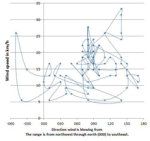 Trace of wind speed vs wind direction of hourly wind recorded at Kelburn, Wellington, between midday 30 July and midday 3 August 2012.
Anyway, you can see that a lot of the time during those four days, the wind at Kelburn (and most of Wellington) was a moderate easterly. And you don't often get that for such a long period.