During the summer of 2012-2013, anticyclones dominated the New Zealand area. Many places had little or no rainfall since early February.
The map below shows the average mean sea level pressure over the New Zealand area over Jan/Feb 2013. There's no doubt about the pressure being high and not changing very much. Because this map shows averaged pressures, we don't see the few troughs that passed across Aotearoa New Zealand during that time.
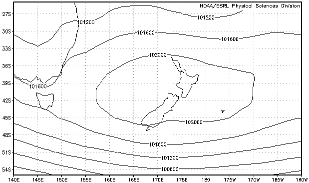 Mean sea level pressure, averaged over the period 0000UTC 24-Jan-2013 to 1800UTC 23-Feb 2013.
Image provided by Physical Sciences Division, Earth System Research Laboratory, NOAA, Boulder, Colorado, from their Web site at http://www.esrl.noaa.gov/psd/
There are reasons why the weather gets into "regimes" like this. It has to do with what meteorologists call the “long waves”. If you've been reading the MetService blog for any length of time, you might notice that this article is very similar to one published in September 2010 titled "Wave Three".
The map below is one way of depicting what the average weather pattern about half-way up the troposphere (the troposphere is that part of the atmosphere in which the weather occurs) looked like over January February 2013. In this pattern, there’s nothing that looks like a high, or low, or front. But there is a bunch of wavy black lines ... which look kind of regular, but not quite. The upper ridges are marked with red dashed curves. Note that there was one over the New Zealand area for most of January 2013..
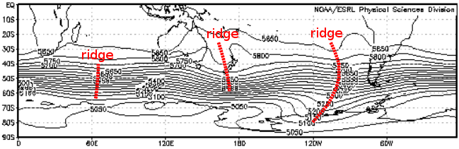 500hPa height, averaged over the period 0000UTC 24-Jan-2013 to 1800UTC 23-Feb 2013.
Image provided by Physical Sciences Division, Earth System Research Laboratory, NOAA, Boulder, Colorado, from their Web site at http://www.esrl.noaa.gov/psd/
Now what if those waves could be separated out into longer ones and shorter ones, so we could see what was going on “under the bonnet”? There happens to be a way of doing exactly this; it’s called Fourier analysis.
The picture below is made from a Fourier analysis of the pattern at midnight Saturday 23 February 2013. It reveals that, in New Zealand’s latitudes, the pattern is dominated by a wave which has one ridge (pink) and one trough (blue) wrapped around the hemisphere. Most important to us is the big area of pink shading – the ridge – near New Zealand. Further south, in the Southern Ocean, the pattern has three waves with a remarkably strong ridge south of South America.
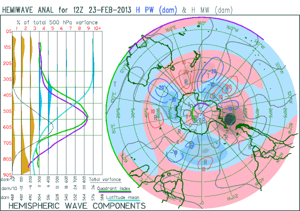 The "long" and "medium" waves about half-way up the troposphere at midnight Saturday 23 February 2013.
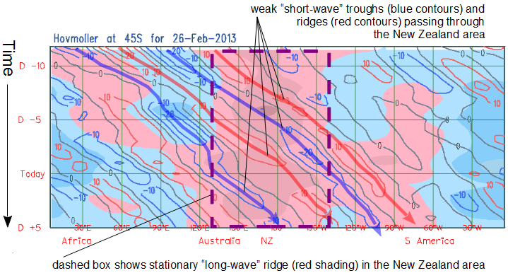
The picture below shows a 12-day history and 5-day expected movement of these longer waves. While shorter waves (some of them corresponding to weather features) are travelling steadily eastwards, the underlying pattern in the New Zealand area remains ridged.