Satellites are one of a meteorologist’s best tools. Satellite images can tell us where weather systems are and how fast they are moving. They can also often help us distinguish between many things such as thick and thin clouds and high and low clouds, as well as detecting snow, fog, volcanic ash, smoke, thunderstorms, and much more.
Main types of satellite images
There are many different types of satellite images that meteorologists can look at, but the three most common that you may hear us talk about are visible, infrared and water vapour. A satellite creates images by recording different wavelengths of energy reflected and emitted by the earth. Each wavelength that it records is called a channel. For example, if an image is recorded between 0.4 and 0.7µm (the range of wavelengths that we can see with our eyes, otherwise known as visible light), we call this a visible channel.
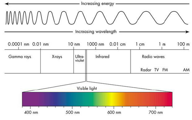 Electromagnetic spectrum, from shortwave radiation on the left to longwave radiation on the right
A visible satellite image uses a channel recorded with visible light, so it is similar to what we would see from space only it is depicted in black and white. Bright areas (high amount of reflected light) show clouds and snow cover, while dark areas show ground and ocean.
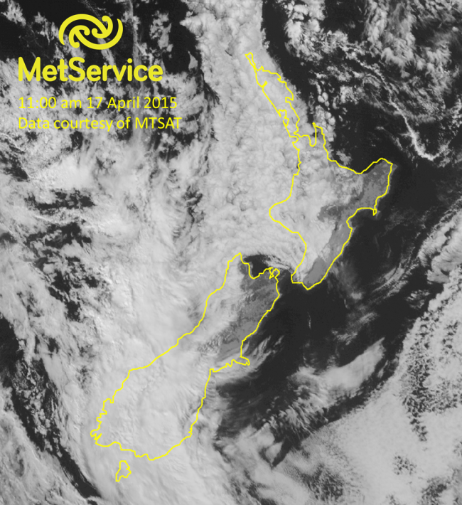 Visible satellite image at 11:00 am NZST on 17 April 2015, courtesy of MTSAT.
The thicker the cloud, the more visible light is reflected back to the satellite, and the brighter it will appear on the image. Thinner clouds do not reflect as much so will appear a lighter grey.
An infrared satellite image uses a channel recorded from infrared energy (typically the 10 to 11µm wavelength is used for these images). This is a longer wavelength, invisible to the human eye, but can tell us a lot about the temperature of an object (a similar principle is used for night vision goggles that detect thermal energy).
Infrared images have the advantage that we can “see” clouds on them throughout the night, as opposed to visible images that can only show reflected visible light during the day. Sometimes we “enhance” an infrared image to highlight certain temperatures with certain colours. In the following example, the image has been enhanced to show colder cloud tops (higher clouds) as red and pink, while the warmer (lower) cloud tops are a lighter grey.
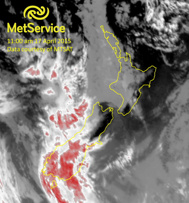 Infrared satellite image at 11:00 am NZST on 17 April 2015, courtesy of MTSAT
A water vapour image is also taken with infrared energy, but at a slightly different wavelength. Water likes to absorb and emit energy at a certain infrared wavelength (6 to 7µm), and we can take advantage of this by measuring that wavelength of energy so that we can detect areas of high and low moisture in the mid- and upper levels of the atmosphere.
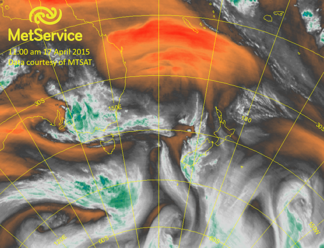 Water vapour satellite image at 11:00 am NZST on 17 April 2015, courtesy of MTSAT.
Clouds and other areas of high mid- and upper level moisture are depicted as white and green, while dry areas aloft are shown as orange and red.
Combined images Since different objects absorb/emit energy at different wavelengths (see the water vapour section above as one example), one of the most powerful ways we can use satellite images is by combining the different channels so that we can tell the difference between, say, clouds and snow or land and sea. One simple way of doing this is channel differencing, where we subtract one channel from another and then display the resulting image. Good examples of how this can be useful include the detection of fog and volcanic ash.
Another common way of combining images is the creation of an RGB image (red, green, blue), in which we assign different channels to be displayed as different colour schemes. For example, if we assign one near-infrared channel and two visible channels to red, green, and blue colours respectively, we can get a “true colour” RGB image that looks almost as if we were viewing the earth from space with our own eyes.
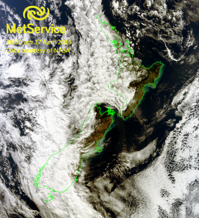 True colour RGB image at 10:30 am NZST on 17 April 2015, courtesy of NASA MODIS
If you ever hear of a “false colour” or “natural colour” RGB image, this just means that we are only using one visible channel instead of two, and the near-infrared channel doubles up as both red and green. We do this when the satellite doesn’t record as many visible channels (e.g. the type of NOAA satellite that generated the image below). Otherwise this type of image looks pretty realistic as well, but it’s just a matter of not needing to use as much actual visible light to create the image.
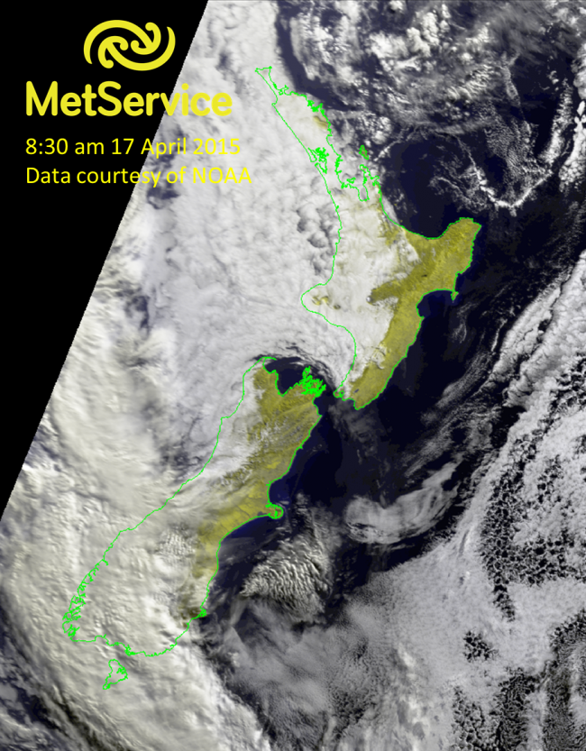 False or natural colour RGB image at 8:30 am NZST on 17 April 2015, courtesy of NOAA
Looking at snow On Monday into Tuesday morning, parts of the South Island and high elevations of the North Island saw some snow. Looking at the visible, true colour RGB or false colour RGB images of New Zealand we can make out the snow particularly in the Southern Alps, but sometimes it can be a bit difficult to distinguish between the white of the snow and the white of the clouds. There is a special snow RGB combination that assigns a visible channel (0.8µm) to red, a near-infrared channel (1.6µm) to green, and an infrared channel (10.8µm) to blue. Taking what we know about different properties between liquid water and ice clouds and snow, we can easily tell the difference between the snow and clouds.
The following image compares the true colour RGB image with the snow RGB image from Wednesday morning. In the snow RGB on the right, the snow shows up as red, lower (warmer) clouds as yellow, and higher (colder, more likely ice than liquid water) clouds as orange.
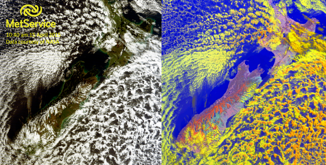 True colour (left) and snow (right) RGB images at 10:40 am NZST on 15 April 2015, courtesy of NASA MODIS.
Snow is shown as red and clouds are yellow and orange.
For more information on the different kinds of satellites and how we receive the satellite data, see Metservice Disk Installation Satellite images are not only pretty to look at, but hold a wealth of information in their different channels!